What to Expect from Super NativePHP
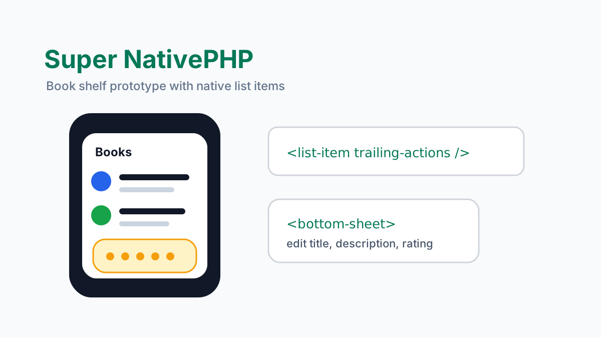
Super NativePHP is best understood as a direction, not just a package name: Laravel developers should be able to build real mobile interfaces from PHP and Blade while the platform renders native UI underneath.
The NativePHP super-native repository is currently a UI kitchen sink for NativePHP Mobile. Its README is explicit that it is a reference app, not a production starter. That makes it useful in exactly the way a kitchen sink should be useful: it shows what the rendering system can do.
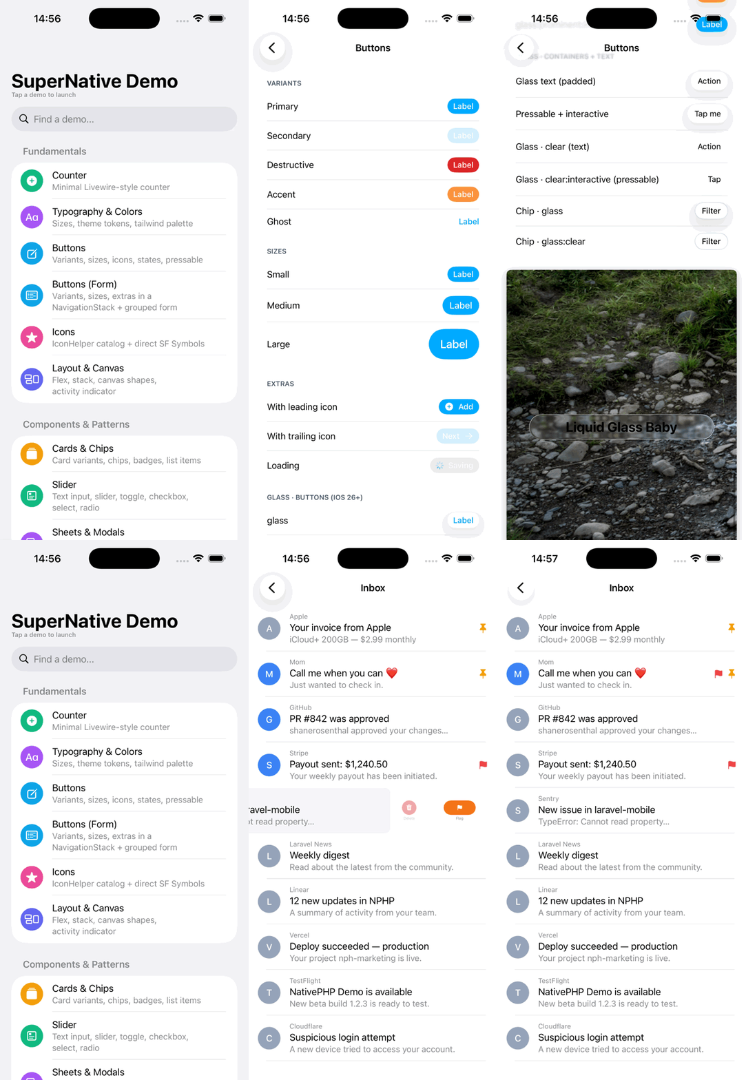
Start with the motion, because that is where the idea becomes obvious. The reference app is not just a counter screen. It moves through native lists, buttons, sheets, glass effects, inputs, and component screens that are authored from Laravel while the platform renders native UI.
Start with the actual reference app
Clone the current reference app into Herd and run it directly. The README shows the NativePHP install and Android run flow; using the real repository name, the commands are:
cd ~/Herd
git clone https://github.com/NativePHP/super-native.git
cd super-native

composer install
php artisan native:install
php artisan native:run android -W --no-vite
The app demonstrates typography, Tailwind color palettes, buttons, counters, borders, shadows, icons, inputs, toggles, images, flex layout, stacked overlays, canvas shapes, list items, activity indicators, and larger creative compositions.
Since the repository is a reference app, read it like documentation with running code. Open app/NativeComponents and resources/views/native together. The interesting part is not one demo screen, it is the repeated pattern: a NativeComponent owns state and actions, and a Blade file describes the native element tree that should be rendered.
The current reference app goes beyond a tiny counter. It includes examples for drawers, tabs, native chrome, refreshable screens, performance demos, gestures, mail, location watching, social-style feeds, store-like product screens, chat screens, video layouts, and experimental visual demos. That breadth is useful because it shows how the system behaves when the UI starts looking like a real app instead of a sample form.
A real book shelf prototype
To test the stack beyond the reference screens, I built a small book shelf app inside the Super Native repo. It adds a /books route with native list items, monograms, descriptions, trailing star ratings, row actions, and a bottom sheet editor.
The full prototype is available at github.com/Matildevoldsen/super-native-books. The README includes the captured simulator GIF and setup commands.
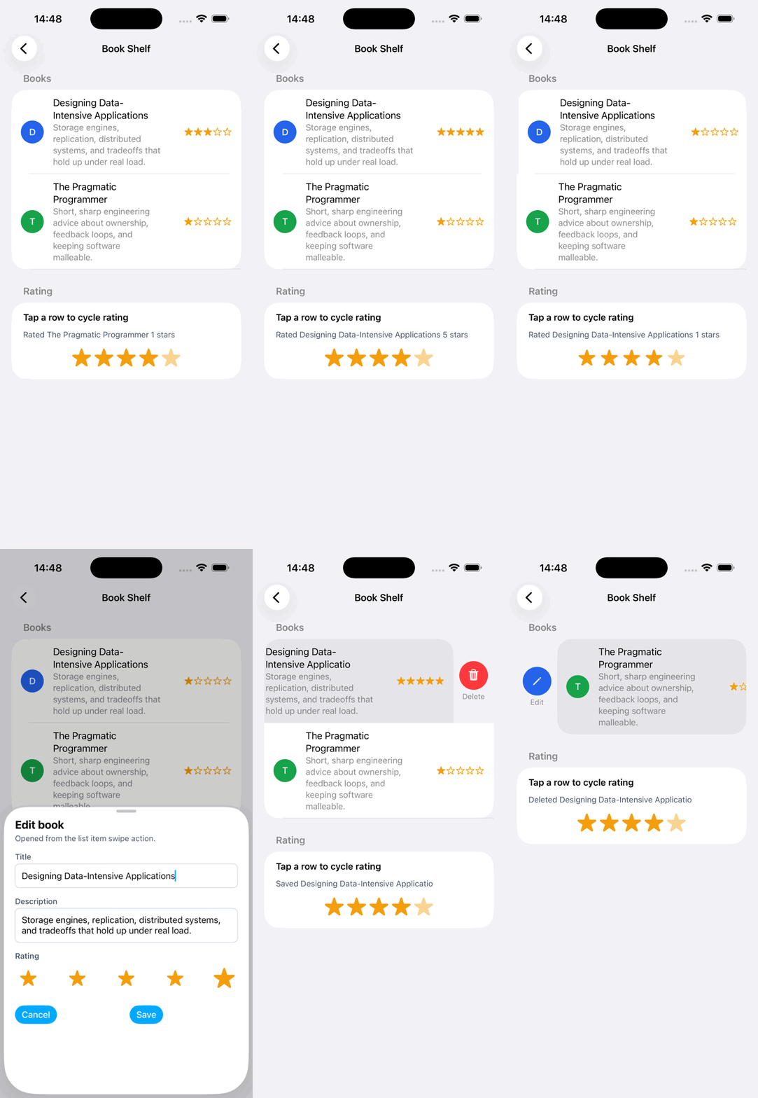
The GIF is the useful proof. It shows native list item density, a rating update, a bottom sheet editor, and row actions in the simulator. This is not a web card pretending to be mobile. The title, supporting copy, monogram, and trailing rating are all rendered through the native list item path.
The edit flow uses a list item action to open a bottom sheet. The sheet edits the title, description, and rating, then saves back into the component state. That is the kind of ordinary workflow a real app needs again and again.
use App\NativeComponents\BookShelf;
use Illuminate\Support\Facades\Route;

Route::native('/books', BookShelf::class)->name('books');
final class BookShelf extends NativeComponent
{
public array $books = [];
public bool $showEditSheet = false;
public ?string $editingId = null;
public function openEdit(string $id): void
{
$book = $this->findBook($id);
if ($book === null) {
return;
}
$this->editingId = $id;
$this->editTitle = $book['title'];
$this->editDescription = $book['description'];
$this->editRating = $book['rating'];
$this->showEditSheet = true;
}
public function render(): Element
{
return $this->view('book-shelf');
}
}<list-item
@press="bumpRatingAt({{ $index }})"
:leadingMonogram="strtoupper(substr($book['title'], 0, 1))"
:headline="$book['title']"
:supporting="$book['description']"
:trailingText="str_repeat('★', $book['rating']) . str_repeat('☆', 5 - $book['rating'])"
:leading-actions="$editActions"
:trailing-actions="$deleteActions" />What the architecture looks like
The super-native app uses NativeComponent classes and Blade templates under resources/views/native. The component owns state and actions; Blade describes the native element tree.
namespace App\NativeComponents;

use Native\Mobile\Edge\NativeComponent;

class Counter extends NativeComponent
{
    public int $count = 0;

    public function increment(): void
    {
        $this->count++;
    }

    public function decrement(): void
    {
        $this->count--;
    }

    public function render(): \Illuminate\View\View
    {
        return view('native.counter');
    }
}
<column class="p-6 gap-4">
<text class="text-2xl font-bold">Counter</text>
<row class="items-center gap-3">
<button label="-" @press="decrement" />
<text class="text-xl">{{ $count }}</text>
<button label="+" @press="increment" />
</row>
</column>That is the interesting promise: Livewire-style state and actions, Blade as the authoring layer, and SwiftUI or Jetpack Compose doing native rendering on the device side.
Build one real screen before judging it
The fastest evaluation is to build one screen from your own product. For a course platform, that could be a lesson list with progress, a video detail header, a transcript tab, and a saved-for-later button. That screen touches layout, lists, state, icons, buttons, and enough data binding to tell you whether the authoring model feels natural.
final class LessonList extends NativeComponent
{
    public int $selectedLessonId;

    public function mount(Course $course): void
    {
        $this->course = $course->load('lessons');
        $this->selectedLessonId = $course->lessons->first()->id;
    }

    public function selectLesson(int $lessonId): void
    {
        $this->selectedLessonId = $lessonId;
    }
}
<column class="p-5 gap-4">
<text class="text-2xl font-bold">{{ $course->title }}</text>
@foreach ($course->lessons as $lesson)
<row class="items-center justify-between py-3" @press="selectLesson({{ $lesson->id }})">
<text>{{ $lesson->title }}</text>
<text class="text-sm text-gray-500">{{ $lesson->duration }}</text>
</row>
@endforeach
</column>That example is intentionally ordinary. If the ordinary screen feels good, then drawers, sheets, tabs, and native controls have a useful foundation. If the ordinary screen is hard to express, the team should know that before it commits to a full app.
Where native-ui fits
The NativePHP native-ui repository is a plugin package named nativephp/native-ui. It adds native UI elements such as buttons, lists, modals, bottom sheets, drawers, sliders, selects, checkboxes, radio groups, tab rows, progress bars, badges, icons, and themed text inputs.
cd ~/Herd
git clone https://github.com/NativePHP/native-ui.git
cd native-ui

composer install
In an app, install it through Composer and publish the pieces you want to customize:
composer require nativephp/native-ui

php artisan vendor:publish --tag=native-ui-config
php artisan vendor:publish --tag=native-ui-layouts
The package currently exposes components for activity indicators, badges, bare, filled, and outlined text inputs, bottom sheets, buttons, button groups, carousels, checkboxes, chips, icons, list items, list sections, modals, native drawers, native lists, virtual lists, progress bars, radio controls, selects, sliders, tabs, tab rows, and toggles. That is enough to prototype serious app chrome without writing platform-specific UI code first.
<x-native-ui::filled-text-input
    label="Search lessons"
    wire:model.live.debounce.300ms="search"
/>

<x-native-ui::button label="Continue lesson" @press="continue" />
<x-native-ui::progress-bar :value="$progress" />
The exact component syntax will keep evolving as the ecosystem matures, so treat the repository as the source of truth while building. The stable idea is more important than any one tag name: Laravel developers get a component vocabulary for native controls instead of hand-writing SwiftUI and Jetpack Compose for every basic interaction.
A drawer example
native-ui includes a Drawer builder and layout traits. The point is that native chrome can be described from Laravel code while the platform owns the drawer behavior.
use Native\Mobile\Edge\Layouts\NativeLayout;
use Native\Mobile\Edge\NativeComponent;
use Nativephp\NativeUi\Builders\Drawer;
use Nativephp\NativeUi\Concerns\HasLayoutDrawer;

class AppLayout extends NativeLayout
{
    use HasLayoutDrawer;

    public function drawer(NativeComponent $screen): ?Drawer
    {
        return Drawer::make(view('native.side_bar'))
            ->width(320)
            ->reveal();
    }
}
Drawer and tab layout are the point where this starts to feel like a mobile framework rather than a rendering trick. App-level navigation should belong to a layout, while screen-level decisions stay in the screen component. That keeps a settings screen, lesson screen, and profile screen from each re-implementing the same app shell.
What to expect next
More native controls that feel like Laravel components instead of platform-specific boilerplate.
Stronger layout conventions around rows, columns, lists, sheets, drawers, and app shells.
Theme tokens that can map Tailwind-style classes to iOS and Android renderer values.
A clearer line between reference apps, plugin packages, and production starter kits.
Better examples for real workflows such as auth, settings, feeds, forms, uploads, notifications, and offline state.
The main risk is expecting the stack to behave like a finished mobile design system today. It is more honest to treat Super NativePHP as a fast-moving reference for what NativePHP Mobile can become. Build narrow prototypes, pin versions, test on real devices, and keep platform escape hatches available for screens that need more than the current renderer can provide.
The most useful way to evaluate Super NativePHP today is to run the kitchen sink, inspect the NativeComponent and Blade pairs, then build one narrow screen from your own product. If that screen feels natural, the rest of the stack starts to make sense.