Advanced Filament Authentication with Auth UI Enhancer
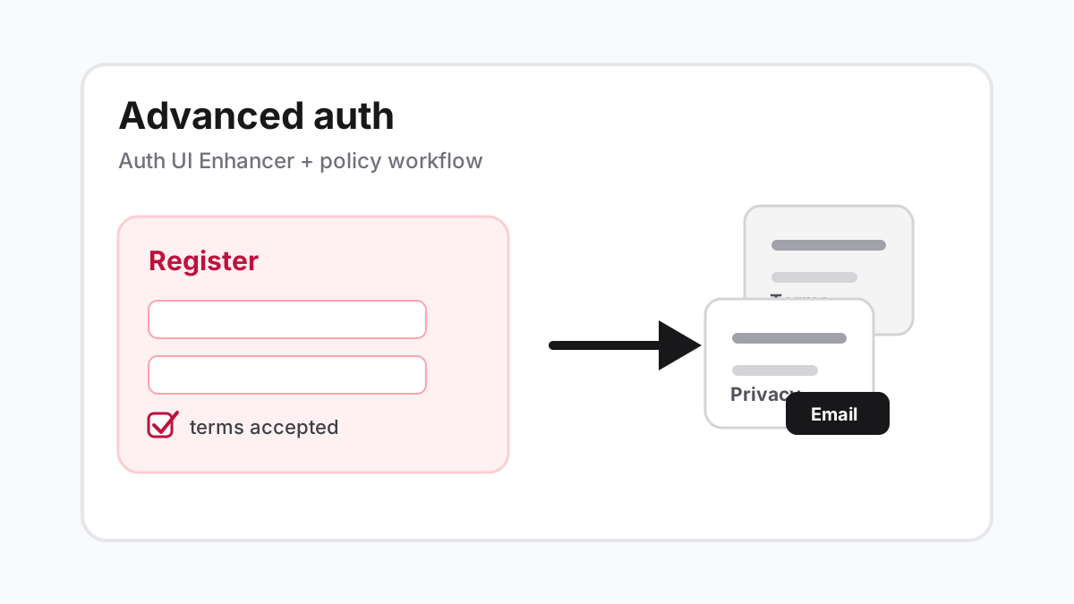
The Auth UI Enhancer plugin is the layout piece of an advanced Filament authentication setup. It turns the plain Filament auth shell into a split screen with a form panel and an empty visual panel, while your application still owns registration fields, terms acceptance, policy pages, notifications, and user creation.
That distinction matters. The Tilly The Coder video this article is based on is called Advanced Filament Authentication in 20 minutes. The video covers installation, a Filament user model, theme setup, split layout customization, a custom registration page, terms checkbox, policy resource, policy observer, and emails when policies change. The plugin helps with the auth layout. The rest is Laravel and Filament application code.
Version and setup
The plugin docs list version 2 for Filament 4 and 5 on PHP 8.2 or newer, and version 1 for Filament 3 on PHP 8.1 or newer. For a new Filament 4 or 5 panel, start with the current package:
composer require diogogpinto/filament-auth-ui-enhancerThe plugin ships Blade views. Tailwind needs to scan those views from the custom Filament theme for the panel, so add this source line to resources/css/filament/{panel-name}/theme.css.
@source '../../../../vendor/diogogpinto/filament-auth-ui-enhancer/resources/**/*.blade.php';After changing the theme source, rebuild your assets. Missing this step is the most common reason the page appears unstyled after installation.
npm run buildRegister the layout plugin
Add the plugin to the panel provider. The package does not replace Filament auth. It wraps the auth pages Filament already knows about.
use DiogoGPinto\AuthUIEnhancer\AuthUIEnhancerPlugin;

$panel
    ->plugins([
        AuthUIEnhancerPlugin::make(),
    ]);
If your panel uses the default login(), registration(), resetPassword(), and emailVerification() calls, the plugin can discover those pages and apply the layout automatically. If you pass custom page classes into those methods, add the plugin trait to each custom auth page that should use the split layout.
use DiogoGPinto\AuthUIEnhancer\Pages\Auth\Concerns\HasCustomLayout;
use Filament\Auth\Pages\Login as BaseLogin;

class Login extends BaseLogin
{
    use HasCustomLayout;
}
That is the clean boundary. The page class can keep product-specific behavior such as tenant lookup, invite handling, or a custom registration schema, while the plugin controls the shell around the page.
Split layout options
The plugin divides the screen into two sections. The form panel contains the actual Filament auth form. The empty panel is the visual side, which can be a background color, an image, or a custom Blade view.
formPanelPosition(): place the form on the left or right side of the desktop layout.
mobileFormPanelPosition(): place the form above or below the visual panel on small screens.
formPanelWidth(): set the desktop form width using units such as %, rem, px, em, vw, vh, or pt.
formPanelBackgroundColor(): use a Filament color palette value, hex color, or RGB color for the form side.
emptyPanelBackgroundImageUrl(): set the artwork, product screenshot, or brand image used by the empty panel.
emptyPanelBackgroundImageOpacity(): tune image strength so the panel does not fight the form.
emptyPanelBackgroundColor(): set the empty panel color when no image or custom view is needed.
emptyPanelView(): replace the image panel with a Blade view that can contain product copy, screenshots, or structured content.
showEmptyPanelOnMobile(): remove the visual panel on mobile when it costs too much vertical space.
A sensible production default is a right-side form, a narrow form panel, one calm visual side, and no empty panel on mobile. Authentication is not the place for a heavy marketing page. The user is there to sign in or create an account.
use DiogoGPinto\AuthUIEnhancer\AuthUIEnhancerPlugin;
use Filament\Support\Colors\Color;

$panel
    ->plugins([
        AuthUIEnhancerPlugin::make()
            ->formPanelPosition('right')
            ->mobileFormPanelPosition('top')
            ->formPanelWidth('42%')
            ->formPanelBackgroundColor(Color::hex('#ffffff'))
            ->emptyPanelBackgroundColor(Color::Zinc, '950')
            ->emptyPanelBackgroundImageUrl(asset('images/auth-dashboard.webp'))
            ->emptyPanelBackgroundImageOpacity('70%')
            ->showEmptyPanelOnMobile(false),
    ]);
Use emptyPanelView() when the side panel needs real markup instead of a background image. Keep that view static and fast. It should not query billing state or depend on the current user because auth pages are often visited before a session exists.
AuthUIEnhancerPlugin::make()
    ->formPanelPosition('left')
    ->emptyPanelView('filament.auth.aside')
    ->showEmptyPanelOnMobile(false);
For small CSS adjustments, the package exposes custom-auth-wrapper, custom-auth-empty-panel, custom-auth-form-panel, and custom-auth-form-wrapper. Use those hooks for polish. If the design needs a completely different auth shell, a custom Filament page is probably cleaner than fighting the plugin.
Custom registration belongs to your app
The video moves beyond layout by adding custom registration requirements. A terms checkbox is a good example: the plugin should not decide whether a user has accepted your terms. Your registration page should validate that field and link to the public documents.
use DiogoGPinto\AuthUIEnhancer\Pages\Auth\Concerns\HasCustomLayout;
use Filament\Auth\Pages\Register as BaseRegister;
use Filament\Forms\Components\Checkbox;
use Filament\Schemas\Schema;

final class Register extends BaseRegister
{
    use HasCustomLayout;

    public function form(Schema $schema): Schema
    {
        return $schema
            ->components([
                $this->getNameFormComponent(),
                $this->getEmailFormComponent(),
                $this->getPasswordFormComponent(),
                $this->getPasswordConfirmationFormComponent(),
                Checkbox::make('terms')
                    ->label('I agree to the terms and privacy policy')
                    ->accepted()
                    ->required(),
            ]);
    }

    protected function mutateFormDataBeforeRegister(array $data): array
    {
        unset($data['terms']);

        return $data;
    }
}
Treat that snippet as the shape, not a reason to hide your policy logic in a page. In a real product, the links, copy, version being accepted, and opt-in fields should be explicit enough that legal and support teams can review them.
Policy pages and update emails
The stronger part of the workflow is making terms, privacy, and cookie documents manageable from Filament. In this codebase, that shape is a Policy model, a PolicyResource, rich content, public routes for terms/privacy/cookies, and an observer that emails users when a policy is created or its version changes.
final class PolicyResource extends Resource
{
    protected static ?string $model = Policy::class;

    public static function form(Schema $schema): Schema
    {
        return $schema->components([
            Select::make('type')
                ->options([
                    Policy::TYPE_PRIVACY => 'Privacy',
                    Policy::TYPE_TERMS => 'Terms',
                    Policy::TYPE_COOKIE => 'Cookie',
                ])
                ->required(),

            TextInput::make('version')->required()->maxLength(25),
            TextInput::make('title')->required()->maxLength(255),
            RichEditor::make('content')->json(true)->required(),
        ]);
    }
}
Version changes are the trigger that makes policy updates meaningful. Editing a typo should not necessarily notify every user. Publishing version 1.3.0 of your terms might. Put that rule in an observer or action where it can be tested.
final class PolicyObserver
{
    public function saved(Policy $policy): void
    {
        if (! $policy->wasRecentlyCreated && ! $policy->wasChanged('version')) {
            return;
        }

        User::query()->chunkById(1000, function ($users) use ($policy): void {
            Notification::send($users, new PolicyUpdated($policy));
        });
    }
}
That is where the advanced auth flow becomes a real application feature. Registration requires acceptance, policy pages are editable, and users can be notified when a material document changes. The split auth layout makes the entry point look polished, but it is not a substitute for those product rules.
Ship checklist
The plugin version matches the Filament major version in the app.
The vendor Blade source path is present in the panel theme and assets were rebuilt.
Default auth pages and custom auth pages both render through the intended layout.
Login, registration, password reset, and email verification are checked on desktop and mobile.
Password managers can still identify email and password fields.
The terms checkbox is validated server-side and links to real policy pages.
Policy version updates notify users only when the version changes or a policy is first published.
Dark mode and long validation messages are tested if the panel supports dark mode.
Use Auth UI Enhancer when the panel login is part of the product experience: SaaS dashboards, client portals, schools, course platforms, and creator tools. Keep the visual side quiet, keep mobile focused on the form, and let Laravel own the business rules around registration and policies.